Introduction
Welcome to the third entry in our “Website Builder Widget of the Week” series, your essential guide to the most useful and little-known widgets included with all Website Builder packages.
In part one we discovered the Before & After widget, a fabulous and highly attractive method of showcasing the effects of your work. In the previous instalment our focus was on the Zoom widget and how you can use it to connect with your customers even if you can’t meet them in person.
This week we’ll take a look at a widget which is a great way of generating interest and excitement for an upcoming product launch: the Countdown widget.
What is the Countdown widget?
Imagine you’re planning a big sale, or you’re launching an exclusive new product. Wouldn’t it be great if you could generate a real buzz ahead of the date, something that will really get people talking about it? Posts on social media would certainly help, but to really add the icing to the cake you want something exciting and engaging. This is where the Countdown widget comes in.

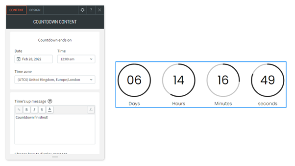
This attractive and eye-catching banner, prominently displayed on your website, will keep visitors informed and build up interest by counting down to the launch date.
How does it work?
Using the Countdown widget really couldn’t be easier! First add it to wherever on your website you would like by dragging and dropping it from the Widgets section of your Website Builder editor. It’s usually located around a third of the way down the list, in the Basics category.

In the pop-up window that appears you’ll have the option to set the date and time that the countdown ends, along with the message that will be displayed.
To really spruce it up, click on the Design tab at the top of the pop-up window and you’ll be able to customise the appearance of the timer, including the colours, size and text.
Tip: Remember that you want it to stand out so it’s best not to use the same colour as your website. Try to pick a colour and style that stands out from everything else on the page, so that the visitors’ attention is immediately caught by it.
How is it best used?
As well as generating a buzz and encouraging discussion, the widget is great for promoting brand awareness and attracting new customers.
Here are some possible examples:
Black Friday sale: With so many suppliers offering discounts on Black Friday, you need to ensure that customers come to your website first. The unusual and memorable nature of the Countdown widget will help you stand out from the crowd, encouraging people to come back on the actual day.
New business launch: If you’re launching a brand new business it can be tough sometimes to drum up publicity. A landing page with a timer ticking down will certainly grab the attention of anyone who sees it, etching the date in their memory and increasing the chance of them telling friends and family about it.
End of sale: As well as promoting the launch of a new sale, the Countdown widget could also be used to advertise its end date. A big timer ticking down to the close of the sale can be a highly effective way of engaging with website visitors and encouraging them to take advantage of the discounted prices while they still can.
And many more…
Drum up publicity, get people talking and generate a real buzz about your business with the memorable Countdown widget, included with every Website Builder plan.
Coming soon…
In the next part of this series we’ll see how easy it is to take bookings online via your website with the Online scheduling widget.
